I Think I Died Yesterday

Manchester, Ky. July 22, 2019
So the strangest thing happened to me yesterday. I died. Sort of. Or at least I think I might have almost tried to. (I’ll explain.)
So I was lying on the couch, fairly exhausted after returning from Manchester, Kentucky, to find Josh’s childhood home- and the apartment where his mother was murdered. I’ll touch on that later. So I had been watching my beloved Egyptian and Roman history documentaries, when I drifted off into blissful sleep. (The kind of which you don’t remember drifting off at all.)
Next think I knew, I had “come to” in a dark, circular room- like a circus tent. I couldn’t make out any edges. I sort of was just there. It was a bit creepy. And to make it even more creepy, I was completely lucid. I knew I was “dreaming”, or at least I thought it was a dream. (I used quotation marks because I know the difference between a dream and being out of one’s body. This sure seemed to be the latter of the two.)
It’s been a few years since I’ve dealt with floating out of my body. When I was a teenager, it began happening more and more and it got to a point where I could simply push with my mind while holding my hands up (like Superwoman) and I immediately was flying at what seemed like hundreds of miles per hour. It’s super fun at times, but more times than not, it’s scary as hell. One of the best times was when I was flying over a forest and could control my direction, and one of the worst times was when I was sitting in a movie theater, surrounded by occupants. Every now and then a person would look over at me. This became more frequent until most everyone in the place was looking at me, simultaneously. If you don’t think that’s creepy AF, I promise, it is.
I knew I needed to get the crap out of there so I stood up and when I turned toward the door, I began to fly- super fast- with my arms outstretched. I was flying down a hall, when I turned around to see all of the people (who were actually vampires, and I knew it then) were close behind me- flying after me. I saw a window at the end of the hall and flew right through it- despite it being closed. I escaped, thankfully. Anyway, these are just a few examples of my lucid “dreams”.
Lately, I’ve been slipping out of my body and into vacant, dimly-lit buildings. It’s so crazy! I’ll suddenly “come to” in my consciousness of being there, and I’ll recognize that I need to wake up. So, I try to find the exit door and can’t. I wander around here and there for what seems like 20 or 30 minutes. Lucid dream time is the same as real time. It’s not speeded up or slowed down, but exactly the same as if you were there IRL.
So after wandering around, meandering about, I start to get bored. Nothing’s happening and it still hasn’t dawned on me that I need to wake myself up- myself. As that realization comes to me (after a while), I know I need to “push” with my mind and concentrate and then I usually wake up after doing so.
Back to yesterday. So, not unlike most other times, I “came to” in this dark, circular room. I perceived that I was alone. Something was off though, and after trying to open my eyes completely, I realized that my right eye was stuck. This had never happened before. I moved my face around, trying to force open both eyes widely. Nada. I couldn’t figure out why my right eye wouldn’t open!
Suddenly. I became aware of a presence in the room with me. I saw a glowing form in the center of the room, but I was too scared to look at it. I told myself that if I looked away, it wouldn’t materialize. (It worked.) But shortly afterward, a male voice called out from the direction of the form and said, “Whatever…”, somewhat malevolently.
That did it for me! I knew that sometimes I needed to move around and shake myself in order to wake myself up, and so I jumped up and down 3 or 4 times. Weirdly though, my feet weren’t on the ground. I was floating and when I jumped, I was moving really fast, like super fast. It seemed that I was in spirit form. It didn’t work and I began to realize that I was stuck in this place- with a hyper-awareness of my consciousness and situation. It was extremely unsettling.
I began to think that maybe I was dead. Maybe I had died in my sleep. I remember having the overwhelming feeling that there was a whole lot more darkness in front of me, in that direction, and around me to the left and right. But I remember having the acknowledgement that “light”, and life itself, was behind me. As in, proximally. I needed to get back to the light! I couldn’t turn around (physically) and was just stuck there, with my right eye sealed, thinking I was dead, but wanting terribly to get back to my life. I had an overwhelming feeling of being alone; like I would never see my loved ones again. I tried jumping again, and focusing on trying to find a way back.
Not too much time had passed when I became aware that I was lying sideways, but I couldn’t see, and both eyes were shut now. I was lifted upward, as if I was floating, upward and then floated backwards and down, as if a wind had blown me up and back in and down again. I could literally feel my spirit going back into my body. Needless to say, it was not fun! I opened my eyes, so very thankful to be back again. Back to the land of the living! I thought about what had happened and realized that what had actually happened was that I had left my body- partially- only my left side had moved out and my right side (around my eye, in particular) was still very much in my body, which would explain why my right eye felt sealed shut. I’ll be happy to never experience that freaky situation again. It really is quite terrifying.
Basic Update: Josh and I are doing really well. I’ve been away from my blog here for so long, with only the periodic update several times per year. Things were really hard between Josh and I when I was still active here, and then I had some heartbreaking situations with one of my daughters that I couldn’t write about- I had to stay very quiet and low-key. Then my little brother died. I was slammed pretty hard, and it was relentless for a while. I’m finally in a good place again and Josh and I have grown so much closer over the past year.
I love that man with a love that is beyond this world. He’s my heart and my very life. Fourteen years is a long time to be in somebody’s life! We’ve grown up together, and love the life that we’ve built together. He’s grown his beard out all shaggy. He’s such a hippy. 🙂
My Baby- Headed to Manchester.

So we decided to take a trip over this past weekend. It was a spontaneous decision. We were thinking about going to a recording studio and checking out where we might begin recording our music together. He had mentioned going back to his childhood home, in Manchester, Kentucky, to seek out his childhood home, and the home that his mom was murdered in.
She had been in an abusive relationship with a guy named Abe. He was the manager at the apartment complex. They began dating, and he began physically abusing her. Josh was only 7 when she decided to take her two kids and leave. Abe had other plans. He cut the phone lines to the entire apartment complex so she couldn’t call for help and then “accidentally shot and killed her when he was cleaning his gun”.
I can’t begin to list the many ways in which her death has affected Josh’s life. I never knew her, but as a woman, I feel that I owe it to her to give him the love and protection and goodness that he deserves. Every now and then she’ll cross my mind, and I’ll go and give Josh a hug- for her. (I usually don’t tell him that it’s for her. I’d want somebody to do that for my son if I were gone though.)
As for my schooling, despite my many obstacles lately, I’m still chugging away at this Master’s degree (Psychology and Addiction Counseling). It hasn’t been easy, but by golly, I carry on. I only have two more classes left after this one, which is Psychopharmacology for Counselors. Good stuff. 🙂
Until we meet again. XoXoxOxO
Manchester, Ky. Carl Zeiss Jena Flektogon 35/2.8 film lens


Monochromejunkie

There’s a reason I chose the username Monochromejunkie: It’s because I’m obsessed with black and white photography. To me, nothing is more beautiful than a bold black and white image with heavy, dark blacks and stark whites. These days, people are so used to simply slapping a filter on something or doing a quick and easy B&W conversion.
it takes a well-trained eye to look out upon a landscape or street scene and be able to convert that over to a B&W in your mind and truly “see” a black and white. Because reds, greens, and blues all convert into various shades of black, white, and grey, you need to know what would truly make a good black and white, because not every scene does.
This past year, I’ve been in a photographic funk and sorely uninspired. 2018 was one of the hardest years of my life. So many troubles with some of my children and their private struggles, along with the death of close friends and loved ones. It really kicked me in the teeth and that alone can kill your passion for your art.
After coming back to my blog and writing again, I rediscovered my friend Gav’s black and white photography. He’s an excellent street photographer, but what he’s really good at, more so than anyone else I’ve ever known, is staying in black and white mode. Nevertheless, year after year, he continues shooting in black and white and never seems to grow bored with it.
Seeing his beautiful black and whites have woken up my first love: black and white photography. I’ve wanted to shoot in B&W mode (only) for a year straight- for a long time, but never had the courage to take that plunge. I know though, that if I don’t do that, then I’ll never commit. And if I don’t commit to truly knowing the ins and outs of black and white and really learning it, then I never will grow as a photographer and artist to the degree that I want to.
I’ve decided to finally take the plunge! I’m putting my camera in monochrome mode and leaving it there for an entire year. It actually began yesterday, so until March 8th of 2020, I’ll be shooting in nothing but black and white. This way, rather than focusing on various colours, I can keep my focus on lighting and exposure. So Gav, if you’re reading this, thank you! You’ve been a major inspiration and have woken up my love of black and white again. It’s not for everybody. But for people like us, it’s what drives us.
I took these yesterday, at Sellersburg park (Indiana) while taking Chance and Diamond on our mile walk. Just as we were getting ready to leave, it started snowing. That was a nice touch. 🙂 (These are basically SOOTC/straight out of the camera.)
A new bud gets its first taste of the snow. Carl Zeiss Jena Flektogon 35-2.8


Cats and Dogs

5:30 a.m.
The most beautiful rain is falling outside right now. I awoke an hour or so ago to the rain falling on my tin roof in a most beautiful enveloping wall of sound. The rain is my favourite thing ever because I feel like God is corralling me off. It satisfies the intense hermit in me that wants to shut my door and windows and seal off the world. The rain says it’s ok to slow it all down to a crawl and not have to be bothered with the things outside my door. The rain sings a most beautiful song. 🙂
I suppose as I grow older (am I really going to be 50 this fall?!), I’m giving in more to my hidden persona; the Jane Goodall-like hippie that wants nothing more than to spend the entire day in the forest, taking macros of little things in their little worlds- up close. I can’t believe I’ve been in school for an entire decade now! I’m so ready to be finished with it all so I can finally- finally- focus on my art, photography, and music. I’m looking forward to closing the books once and for all (along with my many, MANY research papers) and buy an Epson professional printer and set up a small area of our new home (to be, soon); a proper print shop.
It’s going to take a lot of dedication and time, but I’m so looking forward to it. I’ll be afforded the luxury- after school- of not having to work. Even for several years, or never at all, if I want. I can stay home and go out and about and take all the pics I want- go where I like, and do virtually anything I want. When I’m ready, I can put on that periwinkle suit and Addiction Counselor hat (if I so choose) and make my mark on the world as a counselor. But first, I’ll explore my art. It’s an exciting thing to be able to wake up early in the morning and head out with my camera and collection of vintage film lenses in my Nat. Geo. bag. People who aren’t photographers probably don’t get it.
It’s such a rush to be able to go out into the world and see what only I can see. I can shape my perspective in a unique way and be a storyteller without words. To lay in the plush green mossy ground on the forest floor in the warm, afternoon sunshine and spend hours focusing my lens on tiny little things on leaves. I’m a visitor in their world. It’s an incredible thing to be able to make the tiniest corner of a leaf come into focus, making the rest of the leaf the size of a house, by comparison. Ants become giants and mushrooms- stadiums. It’s exhilarating!
But the real rush is taking the loot home and going through all of the images: Sizing up what stays or what gets tossed out. Whittling the pile down until only a few remaining “money shots” remain and those are the ones which will be edited and post processed. A full day’s shoot- and many hours- for 3 or 4 shots in the end. It’s the experience of it all, from loading up the bag to editing the chosen few to submitting or uploading the shots. And it’s all free! You really can’t beat that. It’s therapy. Photo-therapy at its finest.
Although my latest course Addiction Counseling and Families essentially began yesterday, my Discussion Board posts aren’t due until Thursday. Ever the procrastinator, I think I’ll spend the day lounging in my insanely plush (new) pillow top queen bed (that I um…bought Josh for Christmas. That’s right…it’s all for him! 🙂 ) and edit a new batch of pics from our Thanksgiving trip in the Smokey Mountains. Yes, my life ha been so busy and crazy that I’m only now getting around to editing my Thanksgiving shots from 2018!
Despite having 6 vintage (imported) Bulgarian and Romanian film lenses, only the Carl Zeiss Jena Flektogon 35/2.8 (my favourite lens ever) was used- throughout the entire trip. It never left my camera. These are two of many I’ll be editing over the next few days:
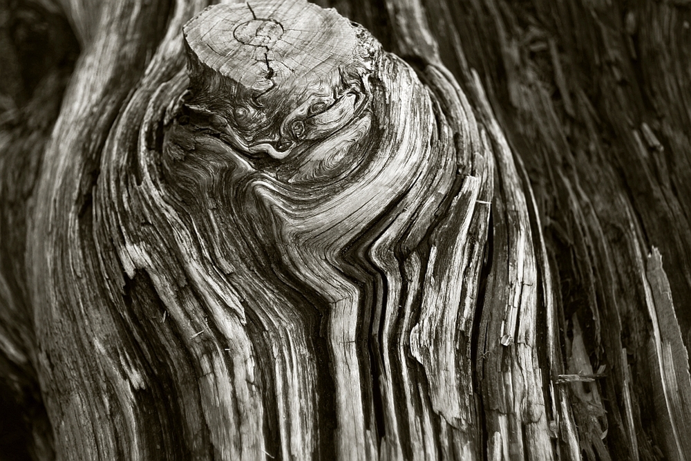
Carl Zeiss Jena Flektogon 35/2.8 film lens (Canon Rebel t3i) – An interesting tree I found on the way up to Clingmans Dome, in Smoky Mountain National Park, in southeastern Tennessee and North Carolina, U.S.
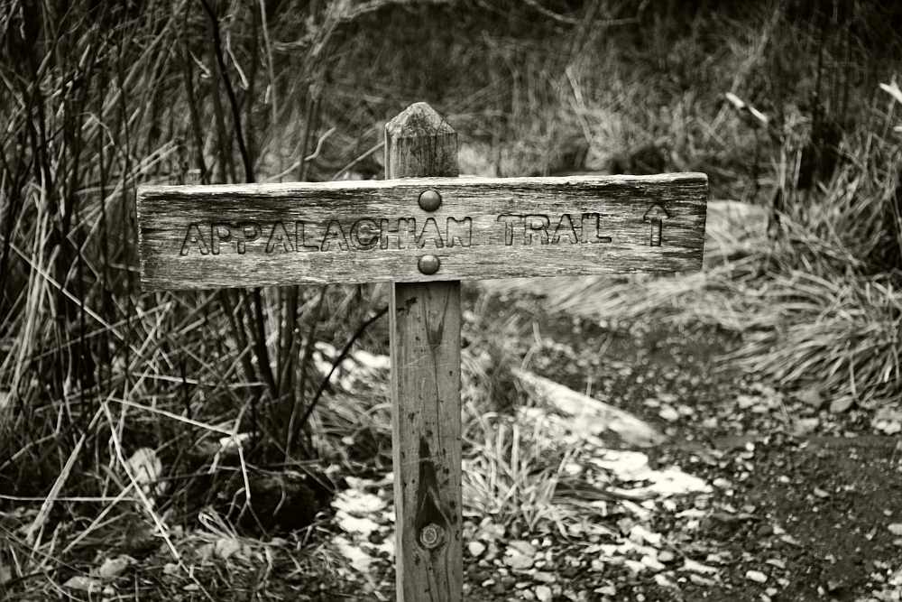
This one is Josh’s. (His capture, my edit.) The Appalachian Trail sign at the base of Clingmans Dome in the Smokies. Carl Zeiss Jena Flektogon film lens 35/2.8- Canon Rebel t3i
Photography Basics and Layering with Textures
So Jen, I realize that if I’m waiting for a chance to “open up” for me to not be so busy, I’ll be waiting for a very long time. I’ve decided to sacrifice a bit of my schoolwork to share with you some of the photography tips and tricks that I’ve developed over the past decade. I’m going to demonstrate the four main areas of a photograph that are the most important to me:
- Composition
- Lighting and exposure
- Mood
- Rule of thirds
These are four areas that must be present in most of my photos and if they aren’t, then I supplement one of the other areas with an extra amount. Such as, if the lighting isn’t the best, kick up the mood. (Etc.) This is a good short list to stick with and think about these things always when taking your photo. Because of the ability to simply slap a filter on a photo in post processing (Iphone apps, Photoshop, Gimp, Picmonkey, etc.) it’s all too easy to fall into the “lazy photographer” trap and think, “Eh…I’ll fix it in Photoshop.” But again, this makes for bad pictures that are heavily “shopped”. I’m going to teach you a few in-camera basics that will give you a good solid pic to start out with. That way, when you dress it up, it’ll be that much better (not that much worse). What I’m going to teach you is going to seem like a lot of hard work! That’s because it is. Everything I do is manually done in “layers” – sometimes one photo can have 20+ different layers blended together. If you learn how to do these things though, instead of just “slapping a filter on it”, you’ll have your own style that is tailor made and it will be very difficult to replicate. Editing is very much like gourmet cooking. We photographers all have our own “recipes” and we guard them closely! I’m going to give you all of the ingredients for you to create your own style. And, if you have your own style- you’ll stand out from your peers in this area. Compare every photograph you take with a painting. The SOOTC / straight out of the camera pic is the canvas. We’re going to use our photo editor to “paint it”.
First, here’s a small list of abbreviations that you’ll need to learn:
SOOTC: straight out of the camera
AP: aperture
Sh. Sp.: shutter speed
WB: white balance
PS: Photoshop
“Shopping”: Photoshopping
BG: background
FG: foreground
B&W: black and white
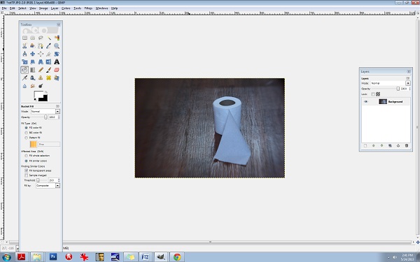
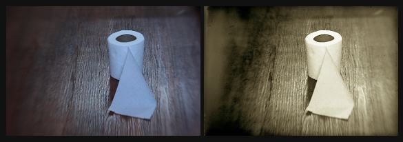
Let’s start with toilet paper.
I took this shot a moment ago on my bathroom floor. I like using toilet paper because it’s simple.
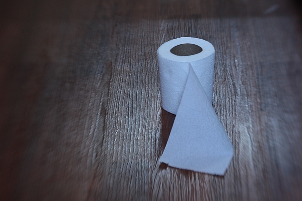
This is a SOOTC shot, or, “straight out of the camera”. I like using the Lensbaby Composer lens because as you can see, it naturally blurs the edges of the frame. This particular kind of lens is great for moody, dramatic images (my trademark style) and especially vintage pieces. Here are the specs for this shot:
Lens used: Lensbaby Composer
Aperture: f/4
ISO: 400
Shutter speed: 1/15 sec.
I know you’re using a point and shoot and that’s ok; it’ll do just fine for this.
The first thing to do, always, with a shot is correct the WB/white balance if necessary, and much of the time, it’s necessary. You can see that the toilet paper is a little blue looking. It’s a good thing to make sure your WB/ white balance is preselected on your camera (this is the shady, cloudy, night shot area). If I would have paid attention beforehand, I would have selected “cloudy”, alas, half the time I don’t. For the record, it’s best if you do.
We’ll adjust the levels (midtones, shadows, contrast, lighting, and highlights in a few moments but let’s continue on first with the basics). Notice the composition: it’s off-centered. When composing your single subject, you should always try to off-center them slightly, no matter how slightly. This is where you’ll learn about “rule of thirds”. Imagine that a 4 lined grid is over your image: 2 lines vertically- 2 lines horizontally. It would look like this:
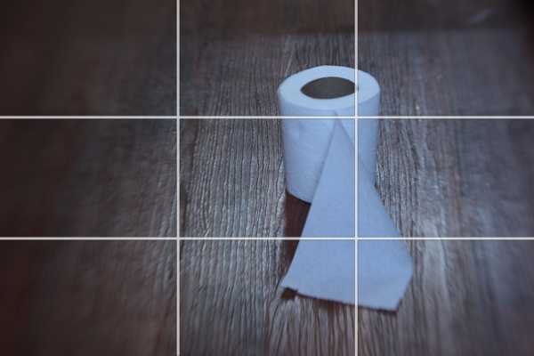
Notice the 4 connecting areas in the center: these are known as “power points”. Always place your subject, or subjects, in one of these areas. I have an invisible grid in my mind’s eye that is always there when I shoot and I’m always mindful of this. Over time, your “natural rule of thirds grid” will kick in and it will become like a second skin: you won’t even need to think about it.
Now let’s do a bit of post processing.
We’ll start with our levels.
We’re going to use GIMP because it’s a free photo editor. It’s a lot like Photoshop and much of the time, I actually prefer GIMP over PS/Photoshop. It can be daunting or overwhelming if you’ve never used it. Remember, fear is nothing more than the lack of education in an area. We’re afraid of what we don’t know much of the time. By learning the basics of photo editing, you’ll take the fear out of the equation and it won’t seem overwhelming any more.
You can find GIMP here:
http://www.gimp.org/downloads/
Just click on the 3rd or 4th line down in the first section.
Install the program and open up your pic : FILE/OPEN
It should look like this:
Be sure to open up your Toolbox panel on the left and have your “layers” there on the right. If these two crucial boxes do not open up on their own, you can do it manually by clicking on the WINDOWS tab at the top right corner. WINDOWS/DOCKABLE DIALOGS/LAYERS and WINDOWS/TOOLBOX.
You’ll need to keep these two boxes open throughout all of your editing.
Almost everything I do has to do with “layers” and this is not uncommon in photo editing. Even the most basic of editing (level adjustments) will often contain several layers and it’s one of the areas of photo editing that is an absolutely MUST to learn. Otherwise, you’ll be stuck with cheesy filters and one dimensional photos.
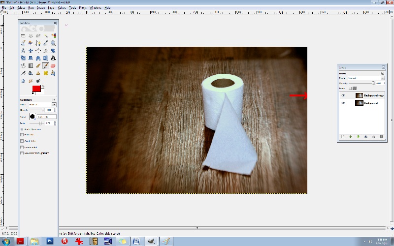
Right click on the Background layer in the LAYER box on the right. Select DUPLICATE LAYER. Now let’s go to the LEVELS area so you can make some minor adjustments.
Go to the COLORS tab at the top and select LEVELS.
You’ll see the LEVELS box pop up:

The diagram at the top is what you’ll want to adjust. Underneath the words INPUT LEVELS you’ll see 3 sliders. These control your shadows/midtones/and highlights. The shadows are the blackest/darkest parts of your image, the midtones are the midrange tones and the highlights are the brightest parts of the image. Always be careful with the highlights slider- you can easily blow out your whites. Let’s start with the middle slider:
It’s naturally set at 1.00 so set it at 36. Set the 1st slider (on the left) that controls the blacks or the shadows to 1.11 and set your highlights slider (the one all the way to the right) to 1.97.
You can see that the lighting is a bit more dramatic. Go ahead and duplicate this layer again. Double click on the text to rename it, (Rename it LEVELS) and then press enter to stabilize it. Rename the new layer CB for COLOR BALANCE.
Now let’s fix the colours and the WB/white balance. Go to your COLORS tab at the top and select COLOR BALANCE. This is another area that I’m constantly using. Let’s get rid of that blue cast. You’ll notice in your COLOR BALANCE area 3 specific ranges: shadows, midtones, and highlights. There are 3 sliders for each one and 6 hues to adjust, per slider. Remember, your highlights are the brighter areas of the photo, in this case, it pertains directly to the toilet paper, so select HIGHLIGHTS. Your goal here will be to move your sliders AWAY from the dominant colours here, which hare CYAN and BLUE. Every photo is different and the colour values and ranges will be different for every one. Instead of simply telling you which values to set your sliders to here, I want you to analyze the photo’s values, highlights in this case, and adjust each slider accordingly. I’ve learned over the years that a good counterbalance to CYAN is yellow and red, so let’s increase those channels’ values, decreasing the CYAN. Again, be sure that your HIGHLIGHTS channel is selected. Be sure to check that it’s indeed the top layer you’re working on (the layer named CB). Ok, let’s go.
Highlights:
Move slider AWAY from CYAN- +29
Move slider AWAY from MAGENTA- + 13
Move slider AWAY from BLUE (toward the YELLOW) -17
Be sure that your readings are the same:
29, 13, -17
The midtones look pretty good so let’s move on to the shadows and give them some warmth.
Move the top slider TOWARD the RED- +9.
Keep the center slider set at 0.
Move the bottom slider TOWARD the YELLOW- -11.
Notice in the LAYERS box, you’ll see a small EYE icon. This is your visibility toggle. If you can see the eye there, it means that that layer is visible. If you uncheck the eye, it means that that layer is currently invisible. This is especially useful as it allows you to toggle back and forth between pics for comparisons. Go ahead and click on the top layer which will set it to “invisible”. Continue clicking the CB-layer EYE and compare your LEVELS pic and your CB/color balance pic.
You’ll notice that the top layer has more reds and yellows- it’s your “warmer” layer. The layer underneath has stronger greens and blues- this is your cooler layer. Let’s mix the two. Notice that each layer has an OPACITY slider. This controls the visibility amount for each layer. Again, always be sure that you’re working in the correct layer beforehand. Choose the top layer, and bring your OPACITY slider down some. Let’s take it to 45%. This will give us a well balanced amount of reds, greens, yellows, and blues in the pic. What this does is increases your colour ranges and adds more depth.
Now, merge all of the layers together. Go to the IMAGE tab at the top, and select FLATTEN IMAGE.
It’s always best to duplicate any image you flatten. You’ll find in editing, it really is a continual cycle of merging and duplicating. So, duplicate it and be sure that you’re working in the top layer. Now, let’s add a textured layer to this. We’re going to bring a dramatic flair to this and give it a haunting feeling.
For this, let’s convert it to a B&W. Yes, all of that colour modification just to convert it to a B&W! The reason for this is to give it a better value and tonal range once it has been converted. There will be added layers of depth by adjusting the colours beforehand.
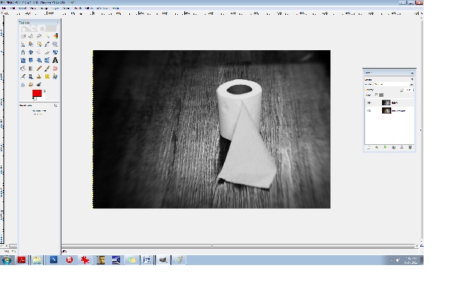
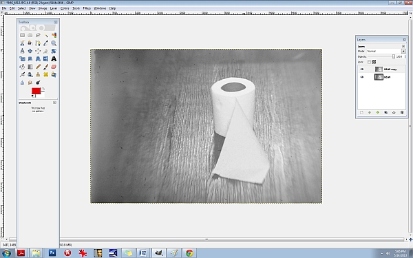
Click on your COLORS tab at the top and select DESATURATE. A small box will appear allowing you to choose from one of 3 areas: lightness, luminosity, and average. Select AVERAGE if you’re not sure which one to go with, but again, because every photo is different and every photo contains different values and ranges, some photos would be best suited for “luminosity” and so on so be sure to test all three for every image and choose the best one. (If you’re still unsure what to go with, choose AVERAGE.)
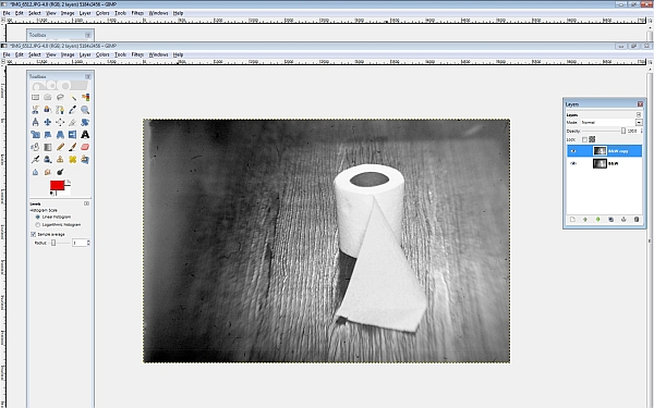
You’ll notice that we have a good range of tones here from the deepest of black to the brightest of white: this is what makes a good black and white photo. Rename the top layer to “B&W”. You should have the coloured image on the bottom and the B&W one on the top. Now, duplicate the B&W layer. You can rename it B&W2.
Let’s add a texture. (Adding a texture isn’t necessary at all, and it can be very tricky at first, but it compliments many photos, especially portraits, abandoned houses and such.) I like to add a texture or several sometimes because it too adds depth to your photo. I like things that look like hair or old film scratches- it gives my images a dirty, ugly-ish appearance and that’s exactly what I like.
So let’s add a dusty old film-scratch texture to this. Here’s what the texture looks like by itself:
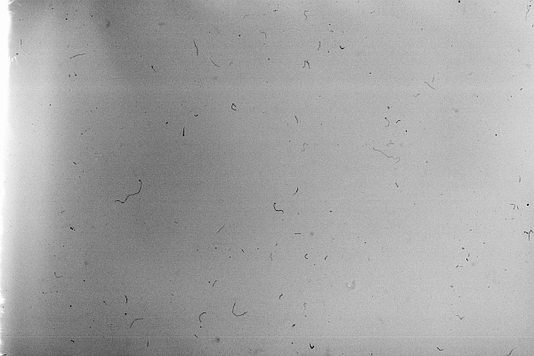
It’s one of my favourites.
When adding a texture to a photograph, it’s very important to make sure that your sizes match up. Check to see what size your image is in GIMP. You can do this by clicking on the IMAGE tab at the top and then select SCALE IMAGE. Notice the sizes there. Be sure that it’s set to PIXELS (the box on the right) and that the width and height are written down (or memorized). Those are the exact measurements that you’ll need to resize your texture to. I recommend using IRFANVIEW as a basic photo viewer, it also reads RAW files so that’s perfect. (I’ve used IRFANVIEW for 8 or so years now and it’s one of my most used tools.) You can get it here:
Download and install that. Once you’ve opened up your pic in IRFANVIEW, resize it to your proper width and height, and then IN IRFANVIEW- select EDIT/COPY. Now we’re ready to paste the texture into GIMP. After copying the texture, go to GIMP and select EDIT/PASTE.
Once the textured layer has been pasted into GIMP, you’ll notice on the right side in your LAYERS box that the top layer has been added. It’s what is now called a “floating channel”. You’ll need to stabilize it like the rest of the layers and it’s very simple to do. Right click the (top) floating channel (your texture layer) and click on ANCHOR LAYER.
Now you should see 3 stabilized layers there in your box. The texture in the top layer, the B&W image in the middle, and the coloured BG/background image in the bottom. We no longer need the coloured image in the bottom channel/layer so you can go ahead and click the eye, switching it over to invisibility if you like, or, you can leave it as is- it won’t hurt anything.
Now it’s time to learn about BLENDING MODES. In the LAYERS box you’ll notice the word MODE above the OPACITY slider. This is the area that gives your layers different effects. The blending modes I use most often are: overlay, multiply, screen, and soft light. There are lots of useful blending modes here though.
Be sure that you’re working in the top layer of the LAYER box (should be named B&W2 copy I think) and take the OPACITY down to about 63.4%. Go to your blending mode area which is MODE (again, it can be found above your OPACITY slider in your LAYER box) and set the mode to SCREEN. This is a bit of a light, silkscreen and gives your images a soft, smoky look. Afterwards, go ahead and flatten the image, again, you can find this area at IMAGE/FLATTEN IMAGE at the top tabs, and then immediately DUPLICATE the layer. It will then look like this:
Next, let’s run it through the LEVELS again to increase the blacks/SHADOWS. I often repeat my processes two and three times throughout one photo edit. Increasing the shadows at this point will give the blacks a smeared/chalky chemical look. Let’s try it:
50/80/46
INPUT LEVELS/3 sliders:
Shadows (1st slider all the way to the left)/ middle slider- midtones- .80/3rd slider all the way to the right (Highlights)- 245. Now, DUPLICATE the top layer again, and let’s hit the LEVELS one more time.
Set them at or around these levels:
INPUT LEVELS:
Shadows/1st slider all the way to the left- 29
Midpoint/middle slider- 1.34
Highlights/3rd slider all the way to the right- 255
Notice the darker “burned” looking areas in the shadows now. It will look like this:
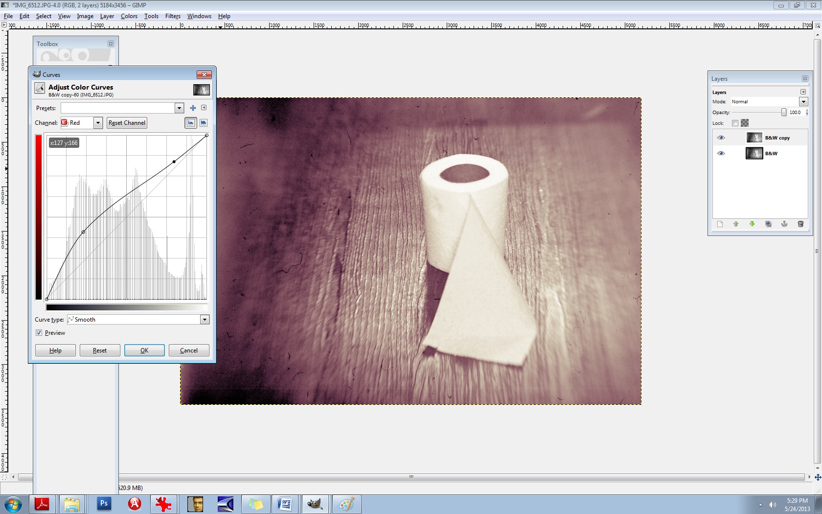
Now I’m going to teach you another useful trick. It’s the CURVES area and it will give us master control over our colours and hues. Go here: COLORS/CURVES from the tabs at the top. You’ll see a CHANNEL dropdown menu box. Inside you will find the RED, GREEN, and the BLUE channels. We’re going to edit each of these three channels individually. Think of your primary colours and the various colours you can create by mixing them. Let’s make a base/foundational colour of bluegreen/yellow. Select your BLUE channel, and then make a backwards or inverted “S”, like this:

Don’t go over the top or it’ll be overkill. Remember to do all things in moderation. Now, let’s kick up the reds. Select the RED channel from the same area (dropdown menu):
Let’s do something a little different here. Experiment. You don’t have to do the exact same thing- find your distinct style here and work with it.
Let’s experiment with the GREEN channel, found in the same area:
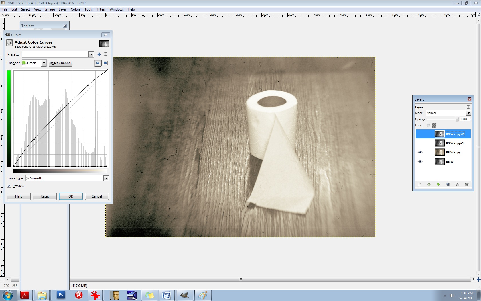
There’s no right or wrong way to do this. Do what makes you happy.
Now, merge the two layers IMAGE/FLATTEN IMAGE and then DUPLICATE the layer once again.
Now you’ll use the same thing: CURVES to adjust your overall lighting. Select COLORS/CURVES. In the CHANNELS box there- the drop-down menu, it’s preset to VALUES. Leave that as is. The diagonal line that you see is the line you’ll be using. Pull the bottom left part of the line straight down to increase your shadows/blacks. As seen here:

It’s still a bit too red for my liking, so let’s run it through the colour balance again to decrease the reds.
Go to COLORS/COLOR BALANCE from the tab at the top and select your MIDTONES channel. Move the slider toward the CYAN -14. Leave the middle slider as is, but set the bottom slider to -1 in the direction of the YELLOW. (In other words, TOWARDS the YELLOW.)
It should now look like this:

It’s a mixture of yellow, red, cyan, magenta, green, and blue but the dominant colours are yellow and green. You’ll notice that it’s not one “flat colour” or tone. There’s more depth here because of the broan ranges in colours. Let’s do one final thing to it to give it a bit of a smoky vignette around the edges. Select your BURN tool. In your TOOLBOX area it’s the tool that is at the bottom, just aboce your colour palette boxes. Move your cursor over it and it’ll read: DODGE/BURN tool. (The DODGE lightens it the BURN darkens it.) We’ll need a bigger brush than the ones offered so let’s create a larger one.
Select your BRUSH tool.
At the very bottom of the pop-up box that displays your brush selection, find the bottom right brush icon and select it. You’ll need to click on the actual CIRCLE brush picture in your brush area to activate it first. That can be found just underneath the OPACITY slider and above the SCALE slider. Once the popup box opens up, you’ll see the needed brush icon in the bottom right corner. If you move your cursor over it, it should read: Open the brush selection dialog
Now at the bottom of THAT area, you will find a NEW BRUSH icon. Click on that. Increase the radius to your desired amount and rename the brush something like LARGE. It will then be added to your brush collection. If you do this, it will come in handy tremendously. You’ll need larger brushes for partial erasing, burning, etc.
Now let’s go back to the burn tool and select your large brush. You’ll need to decrease its size right off the bat, significantly. I set mine to .74% SCALE and 28% OPACITY. Your goal will be to burn the very edges of it neatly, not add a big, puffy smears.
After it’s finished, it should look something like this:

Last but not least, we need to add a bit of a guassian blur to it and then sharpen it. The blur gives it bit more of a vintage finish and we’ll slightly sharpen the focal point afterwards. Let’s go ahead and merge the layers again, IMAGE/FLATTEN IMAGE. (From the tabs at the top.)
DUPLICATE the layer, of course.
Then you’ll choose (from the tabs at the top) FILTERS/BLUR/GUASSIAN BLUR. You’ll see a BLUR RADIUS area which will allow you to set your horizontal and vertical blur radius. Select 2 for both. Click OK.
Next, you’ll need to select (from the tabs at the top) FILTERS/ENHANCE/UNSHARP MASK.
Set the amounts for the following:
RADIUS: 6.4
AMOUNTS: 5.0
THRESHOLD: 0
Over time, you’ll grow more aware of what radius you’ll need for each image.
Now we’re going to layer this underneath our blurred layer. First, let’s name these layers accordingly so we don’t confuse the two. First, be sure to duplicate the bottom layer, always. Anytime you make significant changes to your layer, it’s good practice to duplicate the BG or base layer so you can go back to it if you mess up. So, duplicate that bottom layer. Toggle the EYE icon to invisibility (again, on the bottom BG/layer).
Now, rename the top layer to SHARP and the middle layer to BLUR. The middle layer should be the Guassian Blur layer.
Now you’re going to learn how to erase. First, let’s switch the layers. We want the blurred layer on top and the sharp layer underneath it. You can do this easily by pushing the BLUR layer right up to the top.
We’re all set to erase. Go to your eraser tool which you’ll find in the TOOLBOX area. Select your LARGE brush that you’ve just created. Our goal here is to isolate the focal point, which is the center of the toilet paper roll in this case. We’re needing to erase the blur from the top layer so the sharpened bit can bleed through from the layer underneath. This is one of my most used techniques in editing and I use it with lighting, tones, colours, practically everything. You’ll be able to “paint things” into your photos with your eraser brush this way. I can’t stress the importance of doing this for added depth in an image.
Let’s set our brush to .96% SCALE and about 24% or so for the OPACITY.
Now because we’re going to be erasing FROM the BLUR layer, we’ll need to right click on that layer and select “Add alpha channel”. You’ll need to do this for every layer you’re needing to erase onto. (Only the BLUR layer in this case.)
So let’s erase just around the toilet paper roll itself so that the sharpness will be revealed underneath. If you find that you’re still needing more sharpness, increase your eraser brush’s OPACITY to 60% or so.
I think we’re just about finished here. You can use these steps to create moody, dramatic, “haunting” images or chemically processed, burned “ugly” type works. They’re not for everyone, but they’re my favourite. Here is a comparative before and after:
I strongly encourage you to experiment with these steps. Again, there are no right or wrong ways to do them and really, every person is different and we all like different things. In time and through trial and error mostly, you’ll come to find your own distinct style. It took me a good 7+ years to discover most of these things. (Lots of tears, frustration, and aggravation.) I know this seems like a lot of work, but this is actually a “quick edit”. It can become a complex procedure when 5+ textures are involved. All of this is a lot of fun though. I hope I was able to help you some.
xo
-Birgitta


