Photography Basics and Layering with Textures
So Jen, I realize that if I’m waiting for a chance to “open up” for me to not be so busy, I’ll be waiting for a very long time. I’ve decided to sacrifice a bit of my schoolwork to share with you some of the photography tips and tricks that I’ve developed over the past decade. I’m going to demonstrate the four main areas of a photograph that are the most important to me:
- Composition
- Lighting and exposure
- Mood
- Rule of thirds
These are four areas that must be present in most of my photos and if they aren’t, then I supplement one of the other areas with an extra amount. Such as, if the lighting isn’t the best, kick up the mood. (Etc.) This is a good short list to stick with and think about these things always when taking your photo. Because of the ability to simply slap a filter on a photo in post processing (Iphone apps, Photoshop, Gimp, Picmonkey, etc.) it’s all too easy to fall into the “lazy photographer” trap and think, “Eh…I’ll fix it in Photoshop.” But again, this makes for bad pictures that are heavily “shopped”. I’m going to teach you a few in-camera basics that will give you a good solid pic to start out with. That way, when you dress it up, it’ll be that much better (not that much worse). What I’m going to teach you is going to seem like a lot of hard work! That’s because it is. Everything I do is manually done in “layers” – sometimes one photo can have 20+ different layers blended together. If you learn how to do these things though, instead of just “slapping a filter on it”, you’ll have your own style that is tailor made and it will be very difficult to replicate. Editing is very much like gourmet cooking. We photographers all have our own “recipes” and we guard them closely! I’m going to give you all of the ingredients for you to create your own style. And, if you have your own style- you’ll stand out from your peers in this area. Compare every photograph you take with a painting. The SOOTC / straight out of the camera pic is the canvas. We’re going to use our photo editor to “paint it”.
First, here’s a small list of abbreviations that you’ll need to learn:
SOOTC: straight out of the camera
AP: aperture
Sh. Sp.: shutter speed
WB: white balance
PS: Photoshop
“Shopping”: Photoshopping
BG: background
FG: foreground
B&W: black and white
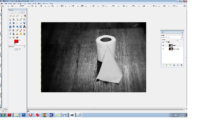
Let’s start with toilet paper.
I took this shot a moment ago on my bathroom floor. I like using toilet paper because it’s simple.
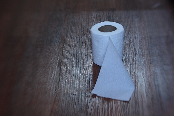
This is a SOOTC shot, or, “straight out of the camera”. I like using the Lensbaby Composer lens because as you can see, it naturally blurs the edges of the frame. This particular kind of lens is great for moody, dramatic images (my trademark style) and especially vintage pieces. Here are the specs for this shot:
Lens used: Lensbaby Composer
Aperture: f/4
ISO: 400
Shutter speed: 1/15 sec.
I know you’re using a point and shoot and that’s ok; it’ll do just fine for this.
The first thing to do, always, with a shot is correct the WB/white balance if necessary, and much of the time, it’s necessary. You can see that the toilet paper is a little blue looking. It’s a good thing to make sure your WB/ white balance is preselected on your camera (this is the shady, cloudy, night shot area). If I would have paid attention beforehand, I would have selected “cloudy”, alas, half the time I don’t. For the record, it’s best if you do.
We’ll adjust the levels (midtones, shadows, contrast, lighting, and highlights in a few moments but let’s continue on first with the basics). Notice the composition: it’s off-centered. When composing your single subject, you should always try to off-center them slightly, no matter how slightly. This is where you’ll learn about “rule of thirds”. Imagine that a 4 lined grid is over your image: 2 lines vertically- 2 lines horizontally. It would look like this:
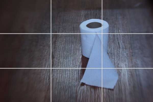
Notice the 4 connecting areas in the center: these are known as “power points”. Always place your subject, or subjects, in one of these areas. I have an invisible grid in my mind’s eye that is always there when I shoot and I’m always mindful of this. Over time, your “natural rule of thirds grid” will kick in and it will become like a second skin: you won’t even need to think about it.
Now let’s do a bit of post processing.
We’ll start with our levels.
We’re going to use GIMP because it’s a free photo editor. It’s a lot like Photoshop and much of the time, I actually prefer GIMP over PS/Photoshop. It can be daunting or overwhelming if you’ve never used it. Remember, fear is nothing more than the lack of education in an area. We’re afraid of what we don’t know much of the time. By learning the basics of photo editing, you’ll take the fear out of the equation and it won’t seem overwhelming any more.
You can find GIMP here:
http://www.gimp.org/downloads/
Just click on the 3rd or 4th line down in the first section.
Install the program and open up your pic : FILE/OPEN
It should look like this:
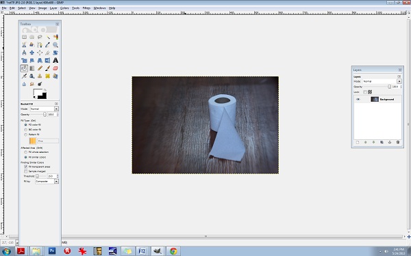
Be sure to open up your Toolbox panel on the left and have your “layers” there on the right. If these two crucial boxes do not open up on their own, you can do it manually by clicking on the WINDOWS tab at the top right corner. WINDOWS/DOCKABLE DIALOGS/LAYERS and WINDOWS/TOOLBOX.
You’ll need to keep these two boxes open throughout all of your editing.
Almost everything I do has to do with “layers” and this is not uncommon in photo editing. Even the most basic of editing (level adjustments) will often contain several layers and it’s one of the areas of photo editing that is an absolutely MUST to learn. Otherwise, you’ll be stuck with cheesy filters and one dimensional photos.
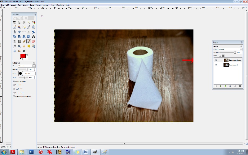
Right click on the Background layer in the LAYER box on the right. Select DUPLICATE LAYER. Now let’s go to the LEVELS area so you can make some minor adjustments.
Go to the COLORS tab at the top and select LEVELS.
You’ll see the LEVELS box pop up:

The diagram at the top is what you’ll want to adjust. Underneath the words INPUT LEVELS you’ll see 3 sliders. These control your shadows/midtones/and highlights. The shadows are the blackest/darkest parts of your image, the midtones are the midrange tones and the highlights are the brightest parts of the image. Always be careful with the highlights slider- you can easily blow out your whites. Let’s start with the middle slider:
It’s naturally set at 1.00 so set it at 36. Set the 1st slider (on the left) that controls the blacks or the shadows to 1.11 and set your highlights slider (the one all the way to the right) to 1.97.
You can see that the lighting is a bit more dramatic. Go ahead and duplicate this layer again. Double click on the text to rename it, (Rename it LEVELS) and then press enter to stabilize it. Rename the new layer CB for COLOR BALANCE.
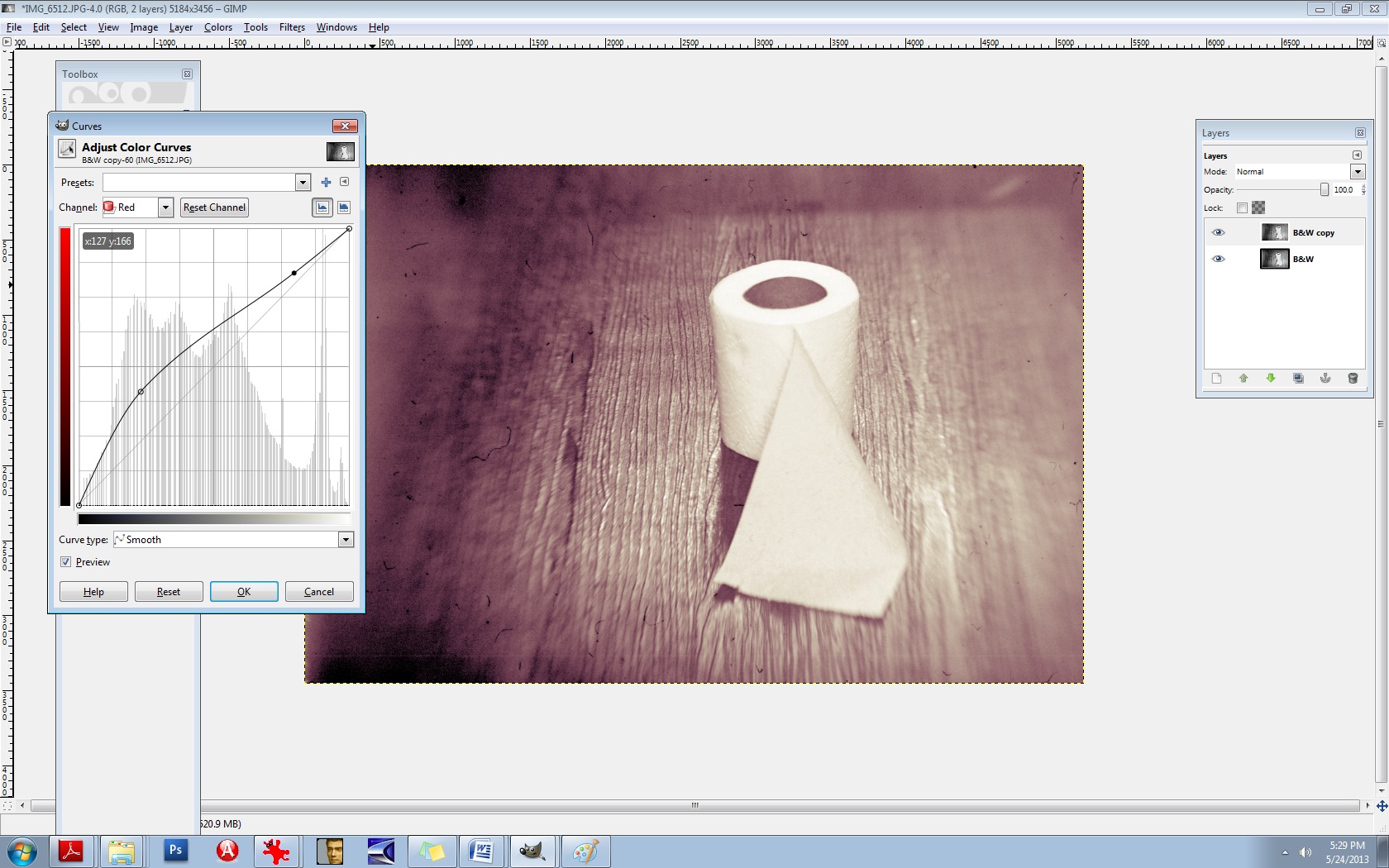
Now let’s fix the colours and the WB/white balance. Go to your COLORS tab at the top and select COLOR BALANCE. This is another area that I’m constantly using. Let’s get rid of that blue cast. You’ll notice in your COLOR BALANCE area 3 specific ranges: shadows, midtones, and highlights. There are 3 sliders for each one and 6 hues to adjust, per slider. Remember, your highlights are the brighter areas of the photo, in this case, it pertains directly to the toilet paper, so select HIGHLIGHTS. Your goal here will be to move your sliders AWAY from the dominant colours here, which hare CYAN and BLUE. Every photo is different and the colour values and ranges will be different for every one. Instead of simply telling you which values to set your sliders to here, I want you to analyze the photo’s values, highlights in this case, and adjust each slider accordingly. I’ve learned over the years that a good counterbalance to CYAN is yellow and red, so let’s increase those channels’ values, decreasing the CYAN. Again, be sure that your HIGHLIGHTS channel is selected. Be sure to check that it’s indeed the top layer you’re working on (the layer named CB). Ok, let’s go.
Highlights:
Move slider AWAY from CYAN- +29
Move slider AWAY from MAGENTA- + 13
Move slider AWAY from BLUE (toward the YELLOW) -17
Be sure that your readings are the same:
29, 13, -17
The midtones look pretty good so let’s move on to the shadows and give them some warmth.
Move the top slider TOWARD the RED- +9.
Keep the center slider set at 0.
Move the bottom slider TOWARD the YELLOW- -11.
Notice in the LAYERS box, you’ll see a small EYE icon. This is your visibility toggle. If you can see the eye there, it means that that layer is visible. If you uncheck the eye, it means that that layer is currently invisible. This is especially useful as it allows you to toggle back and forth between pics for comparisons. Go ahead and click on the top layer which will set it to “invisible”. Continue clicking the CB-layer EYE and compare your LEVELS pic and your CB/color balance pic.
You’ll notice that the top layer has more reds and yellows- it’s your “warmer” layer. The layer underneath has stronger greens and blues- this is your cooler layer. Let’s mix the two. Notice that each layer has an OPACITY slider. This controls the visibility amount for each layer. Again, always be sure that you’re working in the correct layer beforehand. Choose the top layer, and bring your OPACITY slider down some. Let’s take it to 45%. This will give us a well balanced amount of reds, greens, yellows, and blues in the pic. What this does is increases your colour ranges and adds more depth.
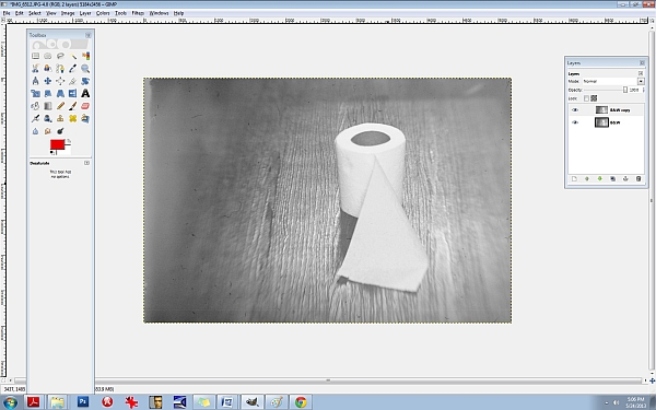
Now, merge all of the layers together. Go to the IMAGE tab at the top, and select FLATTEN IMAGE.
It’s always best to duplicate any image you flatten. You’ll find in editing, it really is a continual cycle of merging and duplicating. So, duplicate it and be sure that you’re working in the top layer. Now, let’s add a textured layer to this. We’re going to bring a dramatic flair to this and give it a haunting feeling.
For this, let’s convert it to a B&W. Yes, all of that colour modification just to convert it to a B&W! The reason for this is to give it a better value and tonal range once it has been converted. There will be added layers of depth by adjusting the colours beforehand.
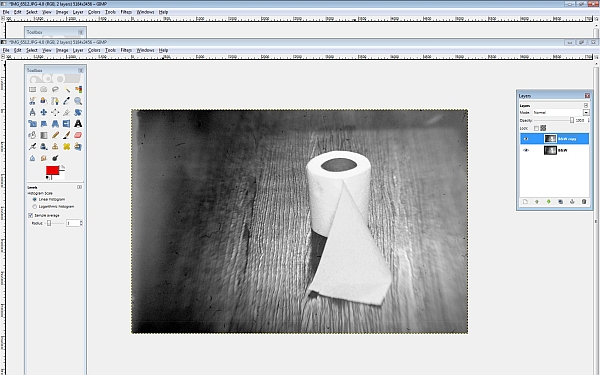
Click on your COLORS tab at the top and select DESATURATE. A small box will appear allowing you to choose from one of 3 areas: lightness, luminosity, and average. Select AVERAGE if you’re not sure which one to go with, but again, because every photo is different and every photo contains different values and ranges, some photos would be best suited for “luminosity” and so on so be sure to test all three for every image and choose the best one. (If you’re still unsure what to go with, choose AVERAGE.)
You’ll notice that we have a good range of tones here from the deepest of black to the brightest of white: this is what makes a good black and white photo. Rename the top layer to “B&W”. You should have the coloured image on the bottom and the B&W one on the top. Now, duplicate the B&W layer. You can rename it B&W2.
Let’s add a texture. (Adding a texture isn’t necessary at all, and it can be very tricky at first, but it compliments many photos, especially portraits, abandoned houses and such.) I like to add a texture or several sometimes because it too adds depth to your photo. I like things that look like hair or old film scratches- it gives my images a dirty, ugly-ish appearance and that’s exactly what I like.
So let’s add a dusty old film-scratch texture to this. Here’s what the texture looks like by itself:
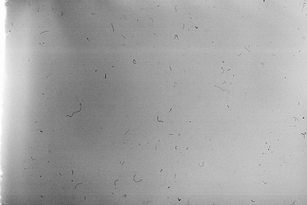
It’s one of my favourites.
When adding a texture to a photograph, it’s very important to make sure that your sizes match up. Check to see what size your image is in GIMP. You can do this by clicking on the IMAGE tab at the top and then select SCALE IMAGE. Notice the sizes there. Be sure that it’s set to PIXELS (the box on the right) and that the width and height are written down (or memorized). Those are the exact measurements that you’ll need to resize your texture to. I recommend using IRFANVIEW as a basic photo viewer, it also reads RAW files so that’s perfect. (I’ve used IRFANVIEW for 8 or so years now and it’s one of my most used tools.) You can get it here:
Download and install that. Once you’ve opened up your pic in IRFANVIEW, resize it to your proper width and height, and then IN IRFANVIEW- select EDIT/COPY. Now we’re ready to paste the texture into GIMP. After copying the texture, go to GIMP and select EDIT/PASTE.
Once the textured layer has been pasted into GIMP, you’ll notice on the right side in your LAYERS box that the top layer has been added. It’s what is now called a “floating channel”. You’ll need to stabilize it like the rest of the layers and it’s very simple to do. Right click the (top) floating channel (your texture layer) and click on ANCHOR LAYER.
Now you should see 3 stabilized layers there in your box. The texture in the top layer, the B&W image in the middle, and the coloured BG/background image in the bottom. We no longer need the coloured image in the bottom channel/layer so you can go ahead and click the eye, switching it over to invisibility if you like, or, you can leave it as is- it won’t hurt anything.
Now it’s time to learn about BLENDING MODES. In the LAYERS box you’ll notice the word MODE above the OPACITY slider. This is the area that gives your layers different effects. The blending modes I use most often are: overlay, multiply, screen, and soft light. There are lots of useful blending modes here though.
Be sure that you’re working in the top layer of the LAYER box (should be named B&W2 copy I think) and take the OPACITY down to about 63.4%. Go to your blending mode area which is MODE (again, it can be found above your OPACITY slider in your LAYER box) and set the mode to SCREEN. This is a bit of a light, silkscreen and gives your images a soft, smoky look. Afterwards, go ahead and flatten the image, again, you can find this area at IMAGE/FLATTEN IMAGE at the top tabs, and then immediately DUPLICATE the layer. It will then look like this:
Next, let’s run it through the LEVELS again to increase the blacks/SHADOWS. I often repeat my processes two and three times throughout one photo edit. Increasing the shadows at this point will give the blacks a smeared/chalky chemical look. Let’s try it:
50/80/46
INPUT LEVELS/3 sliders:
Shadows (1st slider all the way to the left)/ middle slider- midtones- .80/3rd slider all the way to the right (Highlights)- 245. Now, DUPLICATE the top layer again, and let’s hit the LEVELS one more time.
Set them at or around these levels:
INPUT LEVELS:
Shadows/1st slider all the way to the left- 29
Midpoint/middle slider- 1.34
Highlights/3rd slider all the way to the right- 255
Notice the darker “burned” looking areas in the shadows now. It will look like this:
Now I’m going to teach you another useful trick. It’s the CURVES area and it will give us master control over our colours and hues. Go here: COLORS/CURVES from the tabs at the top. You’ll see a CHANNEL dropdown menu box. Inside you will find the RED, GREEN, and the BLUE channels. We’re going to edit each of these three channels individually. Think of your primary colours and the various colours you can create by mixing them. Let’s make a base/foundational colour of bluegreen/yellow. Select your BLUE channel, and then make a backwards or inverted “S”, like this:

Don’t go over the top or it’ll be overkill. Remember to do all things in moderation. Now, let’s kick up the reds. Select the RED channel from the same area (dropdown menu):
Let’s do something a little different here. Experiment. You don’t have to do the exact same thing- find your distinct style here and work with it.
Let’s experiment with the GREEN channel, found in the same area:
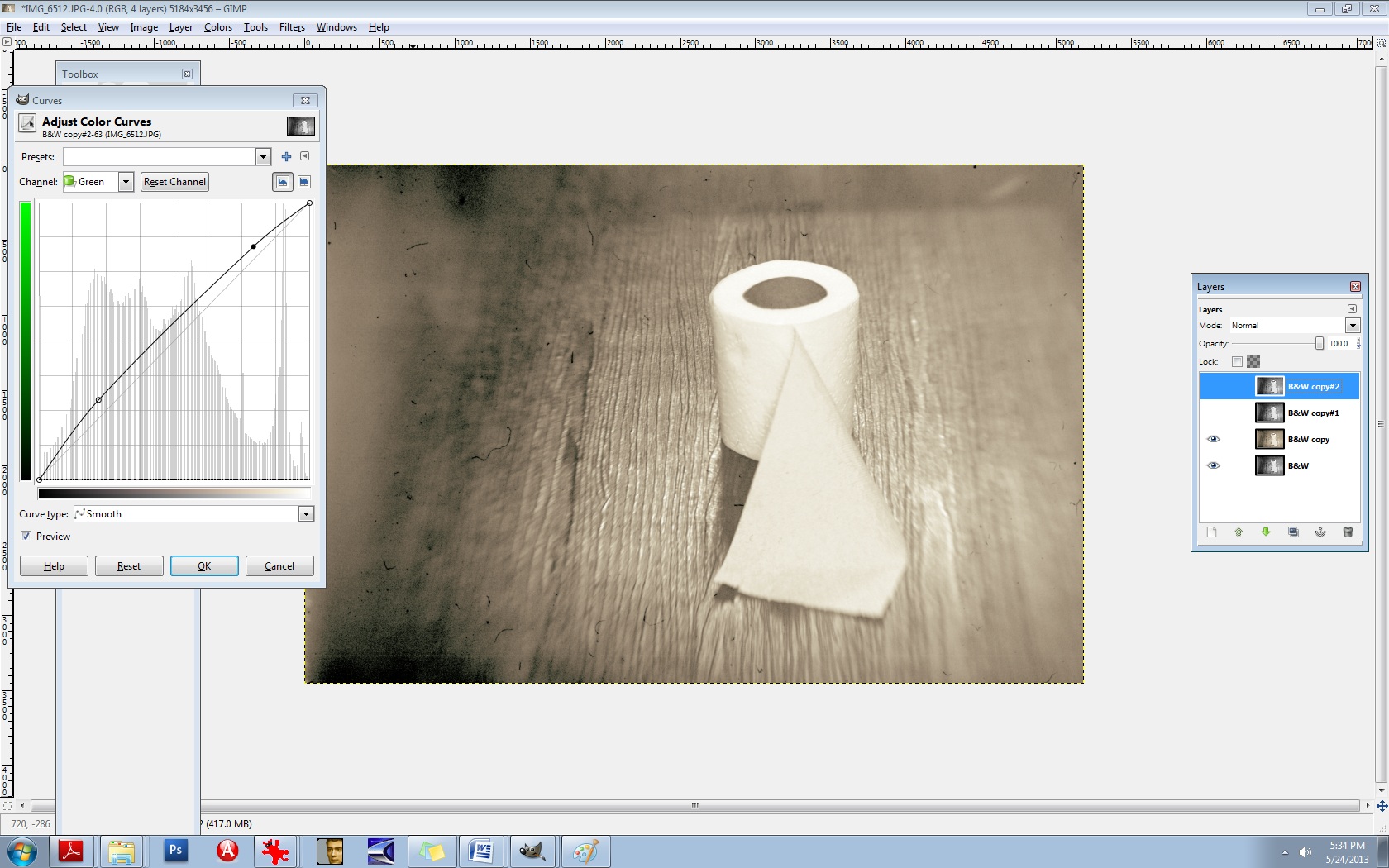
There’s no right or wrong way to do this. Do what makes you happy.
Now, merge the two layers IMAGE/FLATTEN IMAGE and then DUPLICATE the layer once again.
Now you’ll use the same thing: CURVES to adjust your overall lighting. Select COLORS/CURVES. In the CHANNELS box there- the drop-down menu, it’s preset to VALUES. Leave that as is. The diagonal line that you see is the line you’ll be using. Pull the bottom left part of the line straight down to increase your shadows/blacks. As seen here:

It’s still a bit too red for my liking, so let’s run it through the colour balance again to decrease the reds.
Go to COLORS/COLOR BALANCE from the tab at the top and select your MIDTONES channel. Move the slider toward the CYAN -14. Leave the middle slider as is, but set the bottom slider to -1 in the direction of the YELLOW. (In other words, TOWARDS the YELLOW.)
It should now look like this:

It’s a mixture of yellow, red, cyan, magenta, green, and blue but the dominant colours are yellow and green. You’ll notice that it’s not one “flat colour” or tone. There’s more depth here because of the broan ranges in colours. Let’s do one final thing to it to give it a bit of a smoky vignette around the edges. Select your BURN tool. In your TOOLBOX area it’s the tool that is at the bottom, just aboce your colour palette boxes. Move your cursor over it and it’ll read: DODGE/BURN tool. (The DODGE lightens it the BURN darkens it.) We’ll need a bigger brush than the ones offered so let’s create a larger one.
Select your BRUSH tool.
At the very bottom of the pop-up box that displays your brush selection, find the bottom right brush icon and select it. You’ll need to click on the actual CIRCLE brush picture in your brush area to activate it first. That can be found just underneath the OPACITY slider and above the SCALE slider. Once the popup box opens up, you’ll see the needed brush icon in the bottom right corner. If you move your cursor over it, it should read: Open the brush selection dialog
Now at the bottom of THAT area, you will find a NEW BRUSH icon. Click on that. Increase the radius to your desired amount and rename the brush something like LARGE. It will then be added to your brush collection. If you do this, it will come in handy tremendously. You’ll need larger brushes for partial erasing, burning, etc.
Now let’s go back to the burn tool and select your large brush. You’ll need to decrease its size right off the bat, significantly. I set mine to .74% SCALE and 28% OPACITY. Your goal will be to burn the very edges of it neatly, not add a big, puffy smears.
After it’s finished, it should look something like this:

Last but not least, we need to add a bit of a guassian blur to it and then sharpen it. The blur gives it bit more of a vintage finish and we’ll slightly sharpen the focal point afterwards. Let’s go ahead and merge the layers again, IMAGE/FLATTEN IMAGE. (From the tabs at the top.)
DUPLICATE the layer, of course.
Then you’ll choose (from the tabs at the top) FILTERS/BLUR/GUASSIAN BLUR. You’ll see a BLUR RADIUS area which will allow you to set your horizontal and vertical blur radius. Select 2 for both. Click OK.
Next, you’ll need to select (from the tabs at the top) FILTERS/ENHANCE/UNSHARP MASK.
Set the amounts for the following:
RADIUS: 6.4
AMOUNTS: 5.0
THRESHOLD: 0
Over time, you’ll grow more aware of what radius you’ll need for each image.
Now we’re going to layer this underneath our blurred layer. First, let’s name these layers accordingly so we don’t confuse the two. First, be sure to duplicate the bottom layer, always. Anytime you make significant changes to your layer, it’s good practice to duplicate the BG or base layer so you can go back to it if you mess up. So, duplicate that bottom layer. Toggle the EYE icon to invisibility (again, on the bottom BG/layer).
Now, rename the top layer to SHARP and the middle layer to BLUR. The middle layer should be the Guassian Blur layer.
Now you’re going to learn how to erase. First, let’s switch the layers. We want the blurred layer on top and the sharp layer underneath it. You can do this easily by pushing the BLUR layer right up to the top.
We’re all set to erase. Go to your eraser tool which you’ll find in the TOOLBOX area. Select your LARGE brush that you’ve just created. Our goal here is to isolate the focal point, which is the center of the toilet paper roll in this case. We’re needing to erase the blur from the top layer so the sharpened bit can bleed through from the layer underneath. This is one of my most used techniques in editing and I use it with lighting, tones, colours, practically everything. You’ll be able to “paint things” into your photos with your eraser brush this way. I can’t stress the importance of doing this for added depth in an image.
Let’s set our brush to .96% SCALE and about 24% or so for the OPACITY.
Now because we’re going to be erasing FROM the BLUR layer, we’ll need to right click on that layer and select “Add alpha channel”. You’ll need to do this for every layer you’re needing to erase onto. (Only the BLUR layer in this case.)
So let’s erase just around the toilet paper roll itself so that the sharpness will be revealed underneath. If you find that you’re still needing more sharpness, increase your eraser brush’s OPACITY to 60% or so.
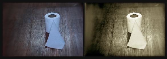
I think we’re just about finished here. You can use these steps to create moody, dramatic, “haunting” images or chemically processed, burned “ugly” type works. They’re not for everyone, but they’re my favourite. Here is a comparative before and after:
I strongly encourage you to experiment with these steps. Again, there are no right or wrong ways to do them and really, every person is different and we all like different things. In time and through trial and error mostly, you’ll come to find your own distinct style. It took me a good 7+ years to discover most of these things. (Lots of tears, frustration, and aggravation.) I know this seems like a lot of work, but this is actually a “quick edit”. It can become a complex procedure when 5+ textures are involved. All of this is a lot of fun though. I hope I was able to help you some.
xo
-Birgitta
Is that Fed Ex?!
So I’m looking at my standard kit lens here. No, it’s not the 17-55 (or the 28 MM 1.8 or the 35 MM 1.4 -the list goes on) that I was wanting, but I am enrolled in five classes this semester and we peasants must take what we can get. The Ebay seller listed this as a new lens, but the Fed Ex package says that it’s refurbished. The plot thickens.
As for my classes, they are:
ALG II
ENG COMP II
WORLD CIV II
PSYCH
SPANISH I
My major is Behavioral Sciences + I’m working on my Substance Abuse certificate simultaneously. Last semster I took 21 credit hours; this month I’ve scaled it down to 16. Between that and my teens, I’m having to take photography where I can get it these days, but I’m contemplating pushing a bit harder throughout the week so I can save Saturdays for a photoshoot. (Or photowalk/city walk, etc.) I hope the doorbell rings 2 more times today…

…
Ringing in the New Year
I wandered around the streets of my hometown on New Year’s Eve in search of “subjects”. I wanted to shoot people but the place was like a ghost town! I’m so drawn to shadows and still life, I’m wondering how I will ever break out of this pattern if I want to venture into street photography. I don’t want to be a simple point-snd-shooter. Composition means everything to me, as do strong lines. I drove to Times Square once, in New York City, and shot street photography at night. My bags had been packed and waiting by the door to go to Texas (from Indiana). my Aunt had been sick and my daughter and I were on our way to see them. They cancelled at the last minute, and so we found ourselves with packed bags, $1,000 and no where to go. I told my daughter to pick a place, anywhere in the U.S. and that’s where we would go. She said, “What about New York?” And so, the next day, we found ourselves driving straight into the belly of the beast: Times Square. Here are some of my photos from that trip: (All photos are shot in manual + natural lighting/no flash.)
Times Square at night, New York, New york
Canon Rebel XSI Sigma 17-70

Modern Day Vintage w/ film grain- Canon Rebel XSI + Sigma 17-70
A mass of people simming in the city sea. W. 45th St.

Near Park Avenue, Manhattan, New York
Canon Rebel XSI Sigma 17-70
I had crawled up to this pigeon in the rain.
The guy was eating. I was watching him. The pigeon was watching me.
Then I was watching the pigeon.

Then the guy was watching me. Then he jumped out of the frame.
I smiled politely. Then I snapped away.

Hurley’s. Manhattan, New York and a little bit of GIMP.
Canon Rebel XSI/Sigma 17-70

Muesum of modern Art
New York, New York
A small crowd gathers to study Monet’s Water Lilies.
Canon Rebel XSI- Sigma 17-70
GIMP

Overlooking Broadway from the Crowne Plaza Times Square hotel. Nice place! Even if the eggs are $9.00.

Coffee for breakfast.
")
Hanging out on Broadway at Times Square. Everything sizzled with energy. The smell of hotdogs permeated everything and there really was steam coming out of the sewers. Just like in the movies. Horns honked. taxis were a streak of canary yellow and the rain drizzled lightly. It was another world. Swarms of people hustled about- headphones attached, eyes making no contact- disappearing into the night.

The beauty of motion blur/long exposure. One of my many passions in photography.

Broadway in classic “Old Hollywood” black and white.

I was almost laying in the street for this one. I like wide angle shots, and prefer verticals over horizontals. I’ve been shooting verticals for years- and my eye is trained for this type of composition. I feel so vulnerable regarding horizontal composition, in comparison. I’m hoping to practice up in that area over the next year.

As seen from my hotel window at night, overlooking Broadway. I was sitting on the executive office desk Indian style, lens pressed to the glass- full panoramic view. I could see the people in the buildings across from me working out at their office gyms, after hours. I wonder if they could see me.

I was fascinated that behind all of the glitz and glamour of Broadway, this is what it boils down to. The viewers arrived (on Broadway) around the corner in limousines, draped in diamonds, but the stars came in through this humble stage door, accompanied by the grimiest dumpster I had ever seen.

Museum of Modern Art
New York, New York
When I walked into the room, it was as if this guy had been waiting for me.
I immediately sunk to my knees and hunkered down to the floor as low as I could go, loweing the exposure so I could get a good silhouette.
I thought it called for a vintage texture (it’s actually about 7 textures combined) and lots and lots of GIMP. I titled the print “Therapy” and sold a matted canvas to a mystery buyer at Redbubble.com for $175.00.
That put a smile on my face.

Museum of Modern Art. I was in the hallway and saw this guy walking up the stairs. It called for a diagonal composition. (Makes me think of Escher, one of my favourite artsits, second to Van Gogh only.)

New York just wouldn’t be the same without its generous splash of fire escapes throughout the city.

But I digress.
Here are a few shots from my walk-around on New Years Eve. The shadows told me it was the right time to go out and shoot.

Film noir/B&W-shadows- it’s where I live.
The streets were completely abandoned on New Year’s Eve. I loved it.

My mother and I rung in the New Year alone in her apartment. She was tucked into her comfy chair and I read to her for an hour out of my book: Anthology of American Poets. (Poe, Dickenson, Longfellow, Frost, and about twelve others.) It was so old fashioned and simple. I took this shot of her two cats in the early afternoon on New Year’s Day. Both cats are black and white. So, this is a black and white shot in black and white of two black and white cats:
")
My mother’s lamp.
There’s almost nothing more beautiful to me than film grain with a dash of gaussian blur.
In black and white, of course. Heavy on the black.
Canon G3/natural lighting/manual exposure

…


